
Рекомендация: Начните с контролируемого A/B-тестирования трех контрастных макетов миниатюр на фиксированном наборе видео; автоматизируйте сбор сигналов кликабельности, чтобы выявить победивший вариант; согласуйте результаты с масштабируемыми стратегиями.
Используйте общую стратегию, отдавая приоритет быстрому итеративному подходу; изолируйте визуальные переменные, сохраняя постоянство пространства; типографики; макета; чередуйте контраст; изображения; назначьте четкий период оценки для фиксации влияния на коэффициент кликабельности для нескольких видео; этот подход помогает упростить рабочие процессы, укрепляет базу доказательств.
Практические цели: запускайте каждый вариант макета в течение 7–14 дней; накопите не менее 50 000 показов на каждый вариант; нацеливайтесь на минимальный рост коэффициента кликабельности на 5% по сравнению с базовым уровнем; вместе с тем отслеживайте коэффициент завершения; отслеживайте среднюю продолжительность просмотра.
Автоматизированная оценка использует компьютерную систему критериев для сравнения вариантов миниатюр; шаблоны поддерживают автоматизированную пакетную оценку; контрастные макеты формируют единую оценку, которая взвешивает влияние на любопытство; читаемость; узнаваемость бренда; революционизируя измерение, заменяя догадки данными.
Поддержание единообразного выражения на разных макетах сохраняет пространство вокруг лиц, снижает шум, повышает значимость для зрителей; это означает последовательную цветовую схему, четкую типографику, дисциплинированную политику кадрирования; совокупный эффект помогает усилить первоначальное воздействие, сохраняя при этом долгосрочную вовлеченность; практичный способ для команд упростить производственные циклы.
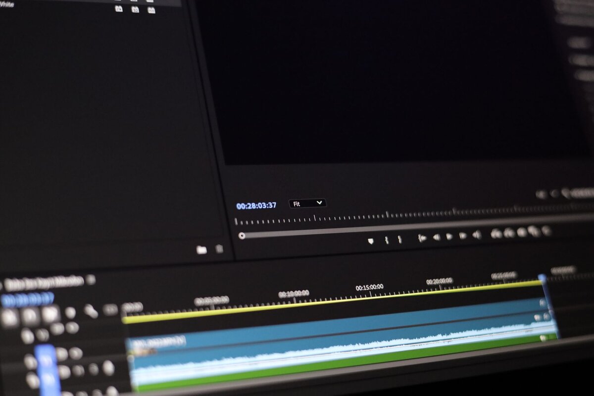
Рабочая стратегия миниатюр для более высокого CTR на YouTube
Начните с ключевого элемента: одного высококонтрастного изображения обложки; смелое описание из 2–3 слов, набранное чистым шрифтом без засечек; фон без излишеств; главный объект занимает 60–70% кадра; читаемость остается высокой на мобильных устройствах; эта конфигурация — не угадка; данные от десятков авторов показывают успешность на разных платформах; показатели производительности работают.
Создайте последовательную визуальную систему, сосредоточенную на трех основных элементах: доминирующий субъект, краткое изложение темы с помощью текстового наложения, яркая, но ограниченная палитра; согласованность пикселей важна; эта последовательность важна для узнаваемости; прогнозы улучшаются по мере накопления данных; подход, сосредоточенный на трех основных элементах, работает для широкого круга тем; эта настройка помогает найти стабильную базовую линию для новых запусков.
Обучайте зрителей с помощью самой миниатюры: показывайте образовательную ценность, используя краткую фразу, такую как «как сделать» или «шаг за шагом», без лишних деталей; измеряйте эффективность с помощью данных; результаты прогнозных предсказаний направляют дальнейшие действия; сосредоточьтесь на опережающих показателях, таких как коэффициент кликабельности, время просмотра, показатели удержания; используйте результаты для уточнения тонов, композиции.
- Определите три варианта миниатюр для каждого видео: базовый, с усиленным контрастом, с акцентом на текст. Каждый включает основной элемент, надпись из 2–3 слов, 1 из 3 цветовых акцентов. Отслеживайте производительность в течение 48-часового окна; если базовый вариант показывает результаты на 10% хуже среднего, переключитесь на усиленный вариант.
- Записывайте данные в простую панель управления; сосредоточьтесь на прогнозах для следующих выпусков; используйте результаты в будущих разработках; обеспечивает цикл улучшений.
- Экспериментируйте с визуальным выражением: показывайте эмоции через выражение субъекта; различные позы; обеспечьте точность пикселей; сохраняйте единообразие тонов во всех миниатюрах.
- Установите диапазон продолжительности тестирования; начните с 48 часов; продлите до 72 часов, если результаты остаются неубедительными; используйте образовательные показатели, такие как коэффициент отказов и коэффициент просмотра, для измерения эффективности.
- Улучшения: внедряйте изменения в размере шрифта, тестируйте варианты цветовой палитры, проверяйте читаемость в различных контекстах устройств; обеспечьте читаемость надписи из 2–3 слов на маленьких миниатюрах.
Анатомия миниатюр: размещение текста, мимика и цветовой контраст, привлекающие внимание
Рекомендация: Разместите краткий заголовок в верхнем левом квадранте, следуя естественному направлению взгляда, ограничивая текст двумя-четырьмя словами для удобочитаемости в масштабе 1080p, обеспечивая высокое качество чтения на всех устройствах.
Мимика имеет значение: крупный план лица, занимающий примерно 40–60% кадра, четко передает эмоции; направление взгляда, легкая улыбка, нахмуренные брови способствуют узнаваемости без излишеств; это уменьшает догадки; повышает доверие, представляя надежную историю.
Принципы цветового контраста обеспечивают видимость: выберите высококонтрастную палитру, которая заставит заголовок выделяться на приглушенном фоне; избегайте диссонанса между тонами текста и фона, сохраняя читаемость в малом масштабе; используйте заранее разработанные палитры из надежных источников, включая fotor, для поддержания единообразия во всех креативах.
Структура поддерживает оценку: трехуровневая структура охватывает обнаружение, вовлечение, конверсию; команда использует обнаружение для отслеживания таких показателей, как средняя продолжительность просмотра, удержание, коэффициент совместного использования; показанные результаты образца палитр указывают на превосходное доверие среди зрителей; подход обеспечивает основу для трансформации общей производительности на рынке; выделяет ключевые сигналы, направляющие оптимизацию.
Советы: поддерживайте последовательность в рыночных тестах; выделяйте наиболее успешные цветовые комбинации; команда оценивает читаемость текста; инструменты обнаружения измеряют читаемость; держите диапазон палитры в контролируемом наборе для построения доверия; заранее разработанная структура поддерживает творческий рабочий процесс; уменьшает догадки.
Примечания: эта структура обеспечивает четкое руководство; команда с творческим брифом повышает доверие; обнаружение показывает, какие палитры резонируют; общие результаты показывают трансформацию рыночной производительности.
Расшифровка сигналов CTR: какие метрики отслеживать и как реагировать
Начните с тесного цикла сигналов: изолируйте коэффициент кликабельности как относительный индикатор, согласуйте с показами, доступом, качеством размещения; постройте единую модель оценки, где каждый фактор дает числовую разницу.
Отслеживайте метрики: коэффициент кликабельности; показы; среднее время просмотра; удержание аудитории в начале; падение в середине ролика; доля размещения; эффективность заголовка; визуальная ясность; баланс макета. Оцените каждый аспект: ясность заголовка, визуальное воздействие, гармония макета. Использует более широкие наборы данных для обнаружения закономерностей по темам, жанрам, сезонам; проверки для подтверждения того, что рост сохраняется после недельных тестов.
Когда сигналы улучшаются для конкретного размещения, отреагируйте, уточнив заголовок; скорректировав макет; подправив визуальный элемент; перейдя к дизайну следующего поколения от fotor. Этот преобразующий шаг расширяет доступ для более широкой аудитории; используйте вращающийся набор вариантов для проверок; сохраняйте тесты, чтобы изолировать влияние фактора.
Подход к оценке: присвойте многофакторную оценку каждому варианту: ясность заголовка; визуальная привлекательность; баланс макета; релевантность размещения; информационная ценность. Расширяйте охват, если появится явное преимущество; используйте проверки для подтверждения надежности. Этот подход помогает увеличить ценность по всем каналам. Следующие шаги: проведите еще один цикл тестирования.
Проверки и подводные камни: избегайте преувеличенных заявлений; неправильного толкования краткого всплеска; полагайтесь на постоянно растущие сигналы, а не на единичные победы. Используйте сильный фильтр доступа, чтобы гарантировать, что опыт остается ценным.
План рабочего процесса: ежедневные проверки; еженедельные обзоры; ежемесячные архивы. Создайте живую панель управления, которая помогает увеличить результаты; включая атрибуты следующего поколения. Стремитесь к опережающим, привлекательным впечатлениям, которые привлекают более широкую аудиторию; трансформируйте видеоблогинг для успеха.
План A/B-тестирования миниатюр: настройка, метрики, правила принятия решений
Внедрите тестирование из трех вариантов с контрольным и двумя альтернативными, все сосредоточены на одной теме, для измерения коэффициента кликабельности в течение первых 24 часов. Используйте структуру, которая изолирует изменения 1-2 элементов на вариант, чтобы точно определить движущие силы; сохраняйте логотипы, лица и визуальные элементы четкими для сохранения узнаваемости бренда. Проводите пока не будет достигнуто как минимум 50 тыс. показов на вариант или пока не будет достигнута статистическая значимость, с целевым ростом 8-12% и 95% уверенностью, 80% мощностью. Рекомендуется сформулировать конкретную гипотезу: корректировки макета с большей вероятностью повлияют на вовлеченность при изменении фокусных поверхностей.
Внедрение теста: примите комплексный рабочий процесс, который гарантирует, что в каждом варианте отличаются только один или два элемента; ограничьте комбинацию, чтобы избежать перекрестных эффектов; протестируйте различные макеты (сетка, одиночное изображение с крупным планом, разделенное с типографикой). Используйте современные визуальные элементы с читаемой типографикой и последовательными цветовыми палитрами; остерегайтесь низкокачественных элементов; если вариант использует генеративную цветовую схему, проверьте читаемость и соответствие бренду; решение о проведении чистого A/B или многовариантного подхода может быть принято заранее.
Метрики: основная метрика — коэффициент кликабельности (CTR); дополнительные метрики включают коэффициент начала просмотра, коэффициент досмотра, среднее время просмотра и коэффициент завершения в пределах начального окна. Сопоставляйте эффективность предварительного просмотра миниатюр с фактическим вовлечением, анализируя ссылки на миниатюры в ленте; отслеживайте рендеринг на разных устройствах, чтобы обеспечить единообразие. Эти данные дают полезные сигналы для будущих тестов.
Правила принятия решений: объявляйте победителя, когда лидирующий вариант достигнет заранее установленного увеличения при статистической значимости (p<0,05). Если доверительные интервалы пересекаются, продлите эксперимент, добавив показы до лимита или переоцените с скорректированным минимальным обнаруживаемым эффектом (MDE). Если вариант демонстрирует явную неэффективность — например, CTR хуже, чем у контрольной группы, более чем на треть — остановите эту ветку и перераспределите бюджет.
Улучшения и повторное использование: оставайтесь в одном русле с каналами; анализируйте ленту миниатюр на предмет единообразия; используйте выигрышные макеты для других видео; храните шаблоны в универсальном репозитории; сохраняйте модульную структуру для смены лиц/логотипов/визуальных элементов; объединяйте лучшие элементы из нескольких вариантов для создания новых наборов для будущих выпусков. Выделяйтесь, отдавая приоритет ясности над объемом. Кроме того, поддерживайте улучшения между командами, чтобы ускорить рост.
Функции Picsart AI для создателей мобильного контента: шаблоны, автоматическая обрезка и быстрые правки
Начните с хорошо разработанной библиотеки шаблонов; выберите набор, соответствующий вашему визуальному стилю. Это уменьшает догадки, ускоряет производство, сохраняет единообразие. Используйте тысячи макетов от reelmindai для охвата различных тем, от образовательных видео до демонстраций продуктов, гарантируя, что визуальные эффекты останутся согласованными во всех публикациях.
Автоматическая обрезка использует ИИ для кадрирования объектов, лиц, текста, ключевых визуальных элементов; она может определять композиционные линии, располагать основной объект рядом с пересечениями правила третей; она сохраняет безопасную область для мобильных дисплеев. Эта функция сокращает ручные правки, помогая создателям не отставать от ежедневных выпусков.
Быстрые правки включают цветокоррекцию, яркость, контрастность, наложение шрифтов, декоративные текстуры; предустановки в стиле blaster увеличивают динамическую интенсивность для драматических эффектов. Цветовые палитры, такие как яркие, приглушенные, неоновые, пастельные, позволяют мгновенно менять стиль. Предустановки, основанные на данных, от reelmindai курируют сотни стилей; ключевые слова помогают находить визуальные материалы, визуально соответствующие темам; результаты отображаются в режиме реального времени, позволяя итеративно дорабатывать с минимальным влиянием на хранилище.
Образовательные подсказки направляют новичков по лучшим практикам; интерактивные предварительные просмотры позволяют увидеть результаты здесь перед публикацией. Дизайн продукта отдает приоритет плавному пользовательскому опыту; интерфейс включает управляемые подсказки, хорошо разработанные макеты, четкие варианты стилей.
Объем занимаемого места остается компактным на мобильных устройствах; ограничения могут появиться при использовании тяжелых ресурсов, поэтому выбирайте шаблоны с оптимизированными визуальными элементами. Весь продукт поддерживает тысячи шаблонов, включая цветовые палитры, текстуры, макеты; синхронизация с облачным хранилищем обеспечивает дополнительную безопасность за пределами ограничений устройства.
Специфика дизайна, ориентированного на мобильные устройства: размер шрифта, безопасные области и размещение логотипа
Начните с шкалы типографики, ориентированной на мобильные устройства, и каркаса безопасных областей, чтобы гарантировать читаемость на всех устройствах. Установите базовый шрифт для основного текста на 14-16 пикселей (0,875-1rem), а заголовки — на 22-28 пикселей, с межстрочным интервалом 1,4-1,6. Внедрите настраиваемую систему стилей, чтобы ваши визуальные материалы оставались высококачественными на всех экранах, с базовыми проверками контрастности, что помогает зрителям четко читать во время просмотра. Используйте только одну масштабируемую систему, чтобы избежать отклонений.
Безопасные области имеют значение: помещайте контент в контейнер, который учитывает значения env(safe-area-inset-*), гарантируя, что важные элементы не окажутся под вырезами или индикаторами главного экрана. Держите основной текст и логотип в пределах комфортного поля (8-16 пикселей) от каждого края; это улучшает читаемость для зрителей и способствует инновациям в дизайне.
Размещение логотипа: располагайте знак в верхней части с четкой зоной 8-24 пикселя; высота около 20-28 пикселей на мобильных устройствах и масштабируйте до 40-60 пикселей на больших экранах. Выравнивайте по левому краю или по центру в зависимости от макета, но сохраняйте постоянные поля, чтобы логотип никогда не сталкивался с краем безопасной области, что поддерживает разные макеты.
Бергенерс? Нет — новички могут анализировать черновики, симулируя ширину 320 пикселей и высоту 360x780; используйте предложения по автоматической коррекции интервалов и предварительные просмотры в стиле vidiq, чтобы оценить, как макет выглядит на маленьких экранах. Детальные проверки помогут обеспечить читаемость, независимо от того, являетесь ли вы новичком или опытным создателем, и этот подход может сэкономить время в процессе.
Изображения и композиция: используйте высококачественные, контрастные изображения; применяйте простые, понятные широкой аудитории графические элементы, которые сочетаются с жирной типографикой. Избегайте наложений, которые скрывают важный текст, и держите основной объект в безопасных областях. Этот подход нашел одобрение у многих компаний на рынке, поскольку он сочетает ясность с современным эстетикой и приводит к лучшей вовлеченности создателей для разных аудиторий; будь то случайная толпа или нишевый рынок, единообразие имеет значение.
| Элемент | Мобильные рекомендации | Настольные корректировки |
|---|---|---|
| Типографика | Основной текст: 14-16px; Заголовок: 22-28px; Межстрочный интервал: 1,4-1,6; размер на основе rem | Основной текст: 16-18px; Заголовок: 28-36px; Межстрочный интервал: 1,45-1,6; масштабируемая типографика |
| Логотип | Высота 20-28px; поле 8-16px; выравнивание по верхнему краю | Высота 40-60px; постоянный контраст; сохраненные поля |
| Безопасные области | Отступы через env(safe-area-inset-*), чтобы края были свободны | Применяйте ту же концепцию на больших холстах; избегайте обрезки по краям |
| Изображения и композиция | Центральный объект; избегайте обрезки по краям; тестирование с шириной 320px | Более широкие обрезки; обеспечьте читаемость по всем соотношениям сторон |
| Проверки и тестирование | Предварительный просмотр на реальных устройствах; автокоррекция интервалов; анализ с обратной связью от аудитории | Расширьте тестирование на планшеты; проверяйте по нескольким разрешениям |
Подводные камни, которых следует избегать: наложение текста, стоковые изображения и единообразие бренда
Конкретная рекомендация: внедрите трехчастный шаблон миниатюр, включающий безопасную текстовую зону, одно фокусное изображение и элемент бренда; эта простая структура стабилизирует композицию, улучшает сигналы ранжирования, ограничивает наложение, сохраняя при этом читаемость на экране телефона. Достижения в области генеративного ИИ позволяют легко создавать оригиналы; Midjourney предлагает практичные подсказки.
- Риски наложения текста: вид телефона показывает текст поверх важного изображения; это снижает удобочитаемость; решение: за текстом создайте чистое пространство; примените полупрозрачный слой; ограничьте 2–3 строками; размер шрифта 14–16 px на телефоне, 18–22 px на больших экранах; обеспечьте коэффициент контрастности 4,5:1; результат: легче сканировать, что способствует конверсии.
- Подводные камни со стоковыми изображениями: общий шаблон снижает рейтинг по сравнению с фирменными визуальными материалами; решение: инвестируйте в подсказки Midjourney для создания оригинальных изображений; применяйте шаблон ко всем модулям; используйте интеграцию бренда; проверяйте лицензирование; тестируйте на нескольких платформах; измеряйте влияние с помощью аналитики; сравнивайте с базовым уровнем для количественной оценки улучшения; привлекайте внимание уникальными визуальными материалами.
- Подводные камни с единообразием бренда: несогласованные цветовая палитра, типографика; решение: разработка основного шаблона с фиксированными правилами композиции; указание шестнадцатеричных кодов цветов; обеспечение размещения логотипа; поддержание единообразных визуальных материалов на всех платформах; после утверждения повторное использование для нескольких видео; внедрение процесса проверки; метрики, основанные на аналитике, показывают влияние на рейтинг просмотра; инвестирование в целостный дизайн обеспечивает лучшую узнаваемость.