
Empfehlung: Führen Sie mindestens drei Versionen von Titelbildern in verschiedenen Formaten aus: 9:16 vertikal, 1:1 quadratisch, 16:9 breit. Behalten Sie mobile Kanäle im Auge; intelligentere Variationen steigern tendenziell das Engagement.
Implementierungshinweis: Adcreativeai ermöglicht saubere, ansprechende Bilder ohne Skripte. Verwenden Sie den Enhancer-Ansatz, um Tipps auf Marken auszurichten; Best Practices fördern Verbesserungen mit einfachen Analysen und werden dann auf alle Kanäle und Videos angewendet.
Designpraktiken: Entworfene Vorlagen bieten Flexibilität; wählen Sie fette Typografie, Farben mit hohem Kontrast und saubere Ränder. Dadurch bleibt die Lesbarkeit über alle Bildschirmgrößen hinweg erhalten und die Konsistenz über Marken und Kanäle hinweg gewahrt. Tipps helfen Teams, diese Regeln konsistent anzuwenden; verwenden Sie diese kanalübergreifend.
Testkadenz: Validieren Sie mindestens drei Varianten pro Video, überwachen Sie die Verbesserungen bei Impressionen, Klicks und Bindungsraten über die ersten 48 Stunden. Verwenden Sie adcreativeai, um diese Versionen schnell zu generieren, und speichern Sie Richtlinien, damit Teams eine einheitliche Arbeit über Marken und Kanäle hinweg für alle Videos gewährleisten können.
Skalierung und Iteration: Mit einem sauberen, flexiblen Ansatz können Teams die kreative Anzeigenarbeit an den Zielen ausrichten und so ansprechende Vorschauen über Kanäle und Geräte hinweg gewährleisten. Halten Sie den Prozess schlank, dokumentieren Sie die Ergebnisse und wenden Sie intelligentere Verbesserungen auf alle Videos an.
Kostenlose KI-TikTok-Thumbnail-Erstellung: 3 vereinfachte Ansätze
Ansatz 1 – Batch-fähige Vorlagen von adcreativeai und designsai. Geschwindigkeitssteigerungen durch die Verwendung dieser Vorlagen für einen klaren, kontrastreichen Look. Produzieren Sie 6–12 Varianten in einem Durchgang; veröffentlichen Sie sie in einer einzigen Sitzung; verfolgen Sie frühe Watch-Metriken, um Anpassungen an Typografie und Farbe vorzunehmen. Verwenden Sie 1280x720 Pixel, behalten Sie das Standardseitenverhältnis bei und wahren Sie die Markenstandards. Passen Sie sie mit handverlesenen Gesichtern und fettem Text an, um sie an Marktereignisse anzupassen. Dies unterstützt YouTuber und Kreative, die Inhalte anstreben, die auf allen Geräten funktionieren.
Ansatz 2 – Dynamische Visuals, abgestimmt auf Ereignisse und Marktbedürfnisse. Designmodule ermöglichen das Austauschen von Hintergründen, Überschriften und Farbschemata, ohne die Konsistenz zu verlieren. Sorgen Sie für Vielseitigkeit, indem Sie Sätze vorgefertigter Segmente speichern, die auf saisonale Ereignisse und Markttrends abgestimmt sind. Stellen Sie sicher, dass die Visuals sowohl auf Mobilgeräten als auch auf dem Desktop schön und klar sind. Verwenden Sie adcreativeai und designsai, um bearbeitungsbereite Komponenten zu generieren; passen Sie sie an, um die Interessen der Zielgruppe widerzuspiegeln; verfolgen Sie die Leistungsmetriken, um zukünftige Varianten zu verfeinern. Dieser Ansatz unterstützt YouTuber, die eine schnelle Iteration benötigen und gleichzeitig Standards und eine starke Markenstimme wahren.
Ansatz 3 – Modulare Designs, die Skalierbarkeit und Wartung ermöglichen. Erstellen Sie eine Bibliothek mit modularen Elementen: Porträts, Textblöcke und Farbüberlagerungen, die schnell neu kombiniert werden können. Dies erhöht die Vielseitigkeit und erhält gleichzeitig die digitale Ästhetik, die YouTuber erwarten. Verwenden Sie designsai, um konsistente Stil-Token zu generieren und sicherzustellen, dass alle Ausgaben den Marktstandards entsprechen. Sorgen Sie für scharfe Pixel und eine pixelgenaue Ausgabe, indem Sie die Typografie auf lesbare Schriftarten und einen engen Unterschneidung beschränken. Dies funktioniert kanal- und ereignisübergreifend; es unterstützt auch die Anpassung in großem Umfang und hilft Ihnen, Inhalte bereitzustellen, die effektiv und hilfreich bleiben, während Sie gleichzeitig das Engagement der Betrachter verfolgen, um die Visuals kontinuierlich zu optimieren.
Wählen Sie ein Thema und ordnen Sie eine Vorlage Ihrem Videothema zu

Wählen Sie ein einzelnes Thema, das Themen widerspiegelt, und ordnen Sie es einer passenden Vorlage zu – dieses Ein-Klick-Setup sorgt für eine konsistente, visuelle Qualität und eine schöne Atmosphäre, je nach Thema. Sie bleiben während des Scrollens engagiert.
Laden Sie erstellte Assets in die Vorlage hoch, um die Produktion zu beschleunigen. Das Hinzufügen von Assets aus einer gemeinsam genutzten Bibliothek vereinfacht die Aufrechterhaltung eines einheitlichen Stils über mehrere Themen hinweg. Shortsninja leitet Teams an, sich an ein einfaches Farbsystem zu halten, was für ein besseres Aussehen sorgt und den Prozess vereinfacht. Erwarten Sie eine prozentuale Steigerung der Klickraten, wenn die Visuals den Erwartungen entsprechen und die einstündige Bearbeitungszeit eingehalten wird.
| Thema | Vorlage | Beste Verwendung | Zeit (min) | Hinweise |
| Lifestyle-Highlights | Sauber-Kontrast | Treffen Sie tägliche Themen, Klarheit zuerst | 7 | scrollt gut; sie bleiben hängen |
| Education Snippets | Minimal Fett | Erklären Sie Konzepte schnell | 5 | konsistente Visuals; schnellerer Upload |
| Tech Pulse | Neon mit hohem Kontrast | Wettbewerbsvorteil in Shortsninja-Videos | 6 | prozentuale Steigerung der Klickrate |
Automatisch auf 9:16 zuschneiden und die Hauptvisuals zentrieren
Schneiden Sie standardmäßig auf 9:16 zu und zentrieren Sie die primäre Visualisierung innerhalb des Rahmens unter Verwendung einer KI-generierten Erkennung.
Aktivieren Sie die Skalierungssteuerung und Feinabstimmung: Halten Sie die Brennpunktaufnahmen innerhalb des zentralen Bereichs (ungefähr 60–70 % der Rahmenbreite) und passen Sie sie an, bis die Kanten sauber bleiben; dies reduziert das Abschneiden über verschiedene Geräte hinweg und erhöht die Sichtbarkeit über verschiedene Tiers hinweg.
Wählen Sie eine Hintergrundfarbe mit hohem Kontrast zum Motiv; vermeiden Sie unruhige Texturen, die von der Kernbotschaft ablenken.
Experimentieren Sie mit 2–3 typografischen Stilen; halten Sie die Typografie lesbar und beschränken Sie Textelemente, um zu vermeiden, dass die Hauptvisualisierung überladen wird.
Verwenden Sie KI-generierte Vorschauen, um Zuschneidungen über verschiedene Geräte hinweg zu visualisieren; Visualisierungsfeedback hilft die Ausrichtung zu verfeinern.
Standardbasierte Prüfungen: Halten Sie gleichbleibende Sicherheitsabstände oben und unten ein, um zu verhindern, dass wichtige Details abgeschnitten werden; wenden Sie nach Möglichkeit eine erweiterte Validierung an.
Workflow-Hinweis: Die erstellten Assets, die in Skalierungspipelines verwendet werden, profitieren von einem vereinfachten Zuschnittschutz, sodass jede Abfolge sauber gerendert wird.
Definition und Metriken: Verfolgen Sie die Erkennungsgenauigkeit der zentralen Visualisierung, messen Sie die Skalierungskonsistenz und überprüfen Sie die Farbausrichtung über verschiedene Stile hinweg.
Warum es funktioniert: KI-generierte Erkennung, die kampagnenübergreifend eingesetzt wird, wurde erstellt, um Zuschneideentscheidungen zu vereinfachen und gleichzeitig die Typografie zu erhalten.
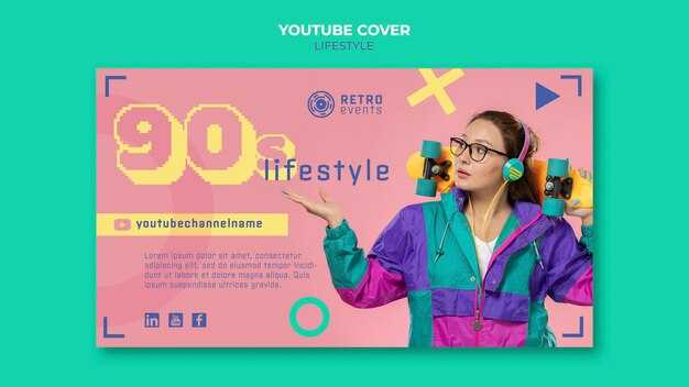
Verwenden Sie fetten, lesbaren Text mit minimalem Text
Beginnen Sie mit einem kurzen Catch-Image, das im oberen Drittel platziert wird, um es an die Drittelregel anzupassen; dies erfordert einen klaren Kontrast, damit die Zeichen sich vom Hintergrund abheben. Beschränken Sie den Text auch auf maximal 3–4 Wörter und zwei Zeilen, um den Rahmen sauber zu halten. Erkunden Sie fette Überschriften und halten Sie Schnörkel auf ein Minimum, um die Wirkung zu erhalten.
Schriftstrategie: Wählen Sie aus den verfügbaren benutzerdefinierten Schriftarten aus; bevorzugen Sie fette serifenlose oder Slab-Optionen mit breiten Innenräumen. Vermeiden Sie ultraleichte Strichstärken in der Hauptzeile; verwenden Sie starke Farbpaare (weiß auf dunkel oder schwarz auf hell), um eine hohe Lesbarkeit zu gewährleisten. Reservieren Sie Großbuchstaben für ein einzelnes Schlüsselwort, wenn eine Hervorhebung erforderlich ist. Verwenden Sie auch ein einfaches System, um Assets zu verwalten.
Layout und Größe: Wenden Sie die Drittelregel für die Positionierung an; zielen Sie auf eine Texthöhe von etwa 48–72 px auf typischen mobilen Bildschirmen ab; beschränken Sie die Zeilen auf zwei und die Zeilenumbrüche auf natürliche Weise. Zentrieren Sie Text auf sauberen Rahmen; richten Sie ihn auf unübersichtlicheren Bildern links aus, um eine Überfüllung zu vermeiden. Testen Sie auf jedem Gerät, um die Lesbarkeit sicherzustellen.
Hochladen und Assets: Behalten Sie beim Hochladen von Elementen ein sauberes Catch-Image mit einer einzigen Vordergrundtextebene bei. Fügen Sie eine einfache Form hinter der ersten Zeile hinzu, um den Blickfang zu verstärken und den Kontrast über verschiedene Hintergründe hinweg aufrechtzuerhalten. Diese Funktion hilft Unternehmensteams, die Markenkonsistenz aufrechtzuerhalten; verwenden Sie verfügbare Markenfarben und -schriftarten, um einheitliches Schreiben und Kampagnenmöglichkeiten zu fördern. Bei einer Vielzahl von Assets gelten die gleichen Regeln, um die Visuals zusammenhängend zu halten. Der Zugriff auf diese Funktionen kann in Basisplänen kostenlos sein, sodass mehr Teams fettgedruckten Text ohne zusätzliche Kosten anwenden können.
Messung und Iteration: Führen Sie schnelle A/B-Tests zwischen zwei Schriftstärken oder Farbkontrasten durch; messen Sie die Lesbarkeit und die Wahrscheinlichkeit, den Blick zu fangen, und passen Sie sie dann an. Dies kann zu einer schärferen Erkennung in Feeds führen und die Möglichkeiten zur Interaktion erhöhen. Dokumentieren Sie die Erkenntnisse in einem Essay mit Gedanken und detaillieren Sie die Prozesse, damit zukünftige Kampagnen die Ergebnisse wiederverwenden können.
Integrieren Sie KI-generierte Hintergründe oder Grafiken für mehr Tiefe
Beginnen Sie mit einer Starthilfe, die die Tiefe definiert: mehrschichtige KI-generierte Hintergründe mit subtiler Parallaxe, Farbverlaufs-Schattierung und atmosphärischer Perspektive. Beginnen Sie mit einer hochauflösenden Basis; der Generator fügt Textur, Lichtabfall und Tiefenhinweise hinzu. Dieser Ansatz hebt das Vordergrundmotiv hervor, erhöht die Anziehungskraft und das Publikumsengagement und steigert das Klickpotenzial.
Wählen Sie Hintergründe aus, die für die Plattform und das Publikum geeignet sind; führen Sie schnelle A/B-Tests mit 3–5 Varianten durch; analysieren Sie die Ergebnisse über Editor-Analysen und konzentrieren Sie sich auf die wichtigsten Metriken wie Wiedergabedauer und Klickrate; verfeinern Sie die Klarheit des Gesichtsbereichs und ändern Sie die Größe der Vordergrundelemente, um die Lesbarkeit in der mobilen Ansicht sicherzustellen.
Stellen Sie sicher, dass das Hauptmotiv dominant bleibt; KI-generierte Hintergründe sorgen für Tiefe, ohne die Gesichtsmerkmale zu verdecken. Wählen Sie subtile Texturschichten, die die Tiefe neben dem Motiv verstärken. Dokumentieren Sie wöchentlich Aktualisierungen der Editor-Palette; dies hält die Werbevisuals frisch und analysiert gleichzeitig die Engagement-Signale, um die Auswahl zu verfeinern.
Studio-Workflow auf der Plattform: Pflege einer Bibliothek mit KI-Assets; Erstellung mehrerer Varianten; Auswahl der leistungsstärksten Assets anhand von Kennzahlen aus Updates. Anpassung der Größe von Assets an vertikale Seitenverhältnisse; Sicherstellung, dass sich die wichtigsten Elemente innerhalb des sicheren Bereichs befinden; Gewährleistung von Farbharmonie und Lesbarkeit der Gesichter während der Bewegung. Kontinuierliche Analyse der Ergebnisse, um fortlaufende Erkenntnisse zu liefern und das potenzielle Wiedergabevolumen zu maximieren.
Export für TikTok: Mobile Vorschau prüfen und Dateieinstellungen korrigieren
Exportieren Sie im Format 9:16, 1080x1920 px, und führen Sie eine kurze mobile Vorschau durch, um saubere Kanten und Lesbarkeit zu bestätigen.
- Canvas und Sicherheitsbereich – Verwenden Sie einen vertikalen Canvas mit einem Seitenverhältnis von 9:16 und 1080x1920 Pixeln. Platzieren Sie die Hauptbotschaft innerhalb des zentralen Bereichs von 720x1280 px, um ein Zuschneiden während der Feeds zu vermeiden. Dieser Ansatz sorgt für starke, lesbare Grafiken auf allen Geräten und unterstützt eine erfolgreiche Kampagne.
- Format und Farbprofil – Wählen Sie JPEG oder PNG; stellen Sie den Farbraum auf sRGB; Zielqualität 92 %. Dies bewahrt Details in digitalen Designs und hält gleichzeitig die Dateigröße kompakt für ein schnelles Rendering auf veedio-Produktseiten.
- Grafik und Typografie – Stellen Sie eine prägnante Aussage sicher; vermeiden Sie dünne Schriftarten und zu kleine Texte. Verwenden Sie kontrastreiche Farben; pflegen Sie ein sauberes Layout, das die Anpassbarkeit und Kreativität hervorhebt. Platzieren Sie die Schlüsselelemente innerhalb des Schutzbereichs, damit sie sichtbar bleiben, wenn das Bild in Veranstaltungen und Feeds zugeschnitten wird.
- Kantensicherheit und Ränder – Stellen Sie sicher, dass sich alle wichtigen Inhalte auf allen Seiten mindestens 40–60 px von den Kanten entfernt befinden. Dies reduziert die Entfernung wesentlicher Details durch Interface-Overlays und gewährleistet die Lesbarkeit auf mobilen Bildschirmen, was in der Regel zu einer wettbewerbsfähigeren Präsentation führt.
- Vorschau-Workflow – Analysieren Sie Vorschauen in Ihrer Software und verwenden Sie dann ein echtes Gerät zur Überprüfung. Beheben Sie Diskrepanzen zwischen simulierter und realer Ansicht; überprüfen Sie bei 50 % und 100 % Zoom, bestätigen Sie, dass kein kritischer Text oder Logos abgeschnitten werden, und bestätigen Sie die Farbtreue nach der Komprimierung.
- Dateiintegrität und Tests – Vergewissern Sie sich, dass die exportierte Datei scharf bleibt; wenn die Komprimierung Details entfernt, passen Sie die Qualität und das Dithering an. Stellen Sie sicher, dass nach der Bearbeitung keine Artefakte zurückbleiben; führen Sie den Vorgang mit anderen Einstellungen erneut aus, bis die visuellen Elemente mit der Aussage übereinstimmen, die Sie dem Publikum vermitteln wollen.
- Workflow und Vorlagen – Beginnen Sie mit einem Starterpaket mit einheitlichen Layouts und passen Sie diese dann pro Veranstaltungsbestellung an. Dies sorgt für ein starkes, zusammenhängendes Erscheinungsbild über die in dem Artikel beschriebenen Kampagnen hinweg und unterstützt ein wettbewerbsfähiges, designerorientiertes Ergebnis.